Role Visual Development
Identity System Design
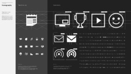
Since 2020, I’ve contributed to shaping YouTube’s identity system across products and marketing, collaborating with a multidisciplinary team of designers, animators, art directors, UX engineers, and project managers. Together, we operate as an internal creative agency, defining and evolving the brand. This includes YouTube logos, logo architecture, typography, iconography, color system, imagery, motion design, UI/UX, and generative AI.
YouTube Art Department
Creative Director Chris Bettig
Program Manager Ash Qualischefski
Art Directors Amy Yip, Jessie Zo, Yeojin Shin, Chelsea Beck
Staff Designer Robyn Lee
Designers ChingFa Lung, Drake Manalo, Earvin Fanfair, Neville Hew, Rachelle Moon, Tais Bishop, Sandra Seo, Niv Bavarsky
Senior Motion Designers Andrew Lebov, David Amichai
Animation Director Nataly Menjivar
Creative Engineering Lead Maegan Clawges
UX Engineers Kelsey Mayfield, Mattaniah Aytenfsu, Henry Desroches
Design Manager Jesse Lefkowitz
Head of Global Brand Marketing Standards Laurel Su
Global Brand Operations Manager Shane Burke
Design Lead Florencio Zavala
UX Designer Lyndsey Jimenez
Creative Producer May Azcue
01 Design in Action
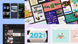
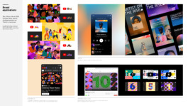
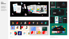
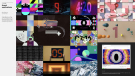
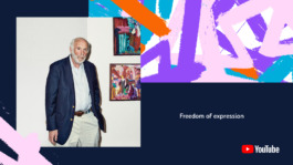
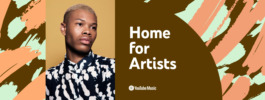
Curated examples showcase how YouTube’s visual system delivers an immersive brand experience across diverse touchpoints. The design system ensures a cohesive and engaging user journey by seamlessly adapting product interfaces to global marketing campaigns.
Whether in digital, physical, or interactive spaces, the brand provides a unified experience that resonates with users. These examples showcase the system’s versatility, highlighting how YouTube’s identity scales effortlessly across platforms and integrates naturally into the brand experience.
Design Philosophy
Our first step was establishing a unified design philosophy connecting product and marketing teams while staying true to YouTube’s mission.
This foundation empowered us to expand YouTube’s visual identity across all platforms, focusing on consistency, clarity, and purpose.
Human
Diverse, Candid, Authentic
The vast majority of YouTube’s content is created by real people: non-professionals with cameras and ideas to share. Their little imperfections lend YouTube’s corpus a sense of humanity that very few other brands can own. Our design should never appear as if by magic. We should always let the viewer know that behind every expression is a real person.
Connected
Community, Belonging, Engaging
People come to YouTube to interact with and learn from other people. Everyday, more than a billion people from cultures around the globe meet and share their points of view. Our brand expressions celebrate these relationships, both philosophically and literally. They should never feel isolated or lonely.
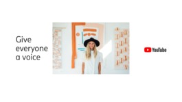
We believe that everyone deserves to have a voice, and that the world is a better place when we listen, share, and build community through our stories.
Expressive
Vibrant, Imaginative, Intriguing
Whenever anyone posts a video to YouTube, they are expressing their point of view. Our design is never generic. It takes a bold stand, and is colorful, opinionated, and
reflective of the world. By communicating with an increasingly diverse range of specific voices, we expand our reach to new people all of the time.
Story-driven
Active, Perspective, Clear
Every video has a story to tell. Every upload adds another chapter to YouTube’s narrative. Our design feels like part of a greater story. We meet our characters in a singular moment. We can feel a sense of the plot and the action that has brought them to this point — and it’s clear that the action won’t stop when the moment is over.
02 Visual System
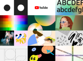
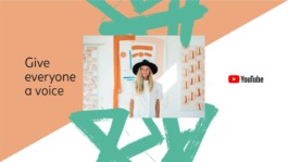
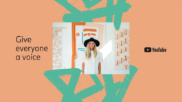
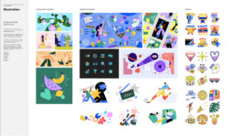
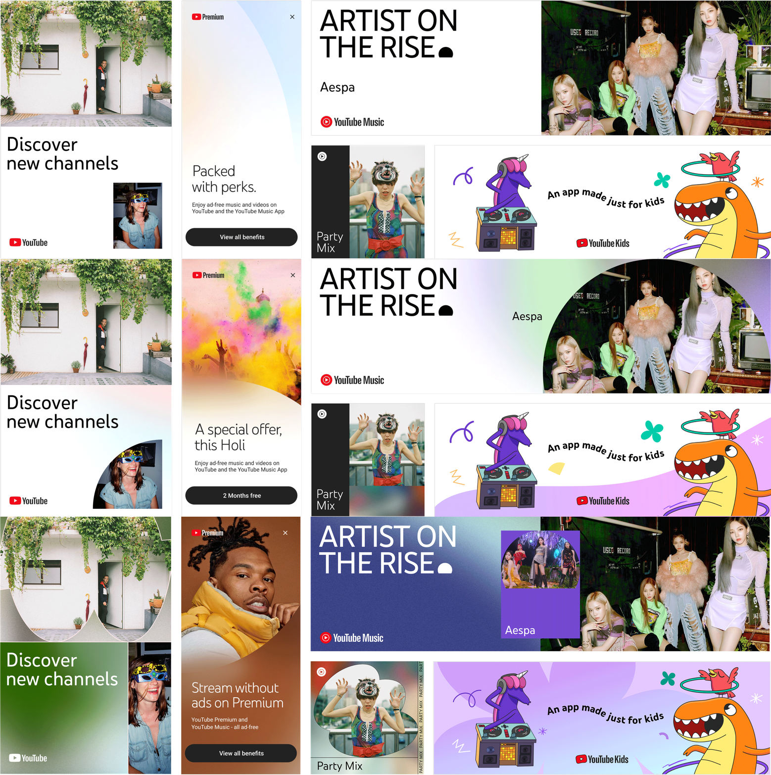
I was instrumental in creating YouTube’s dynamic visual system, driving the brand identity across product design and global brand operations. This system offers various visual expressions, delivering consistency while remaining adaptable.
Creating visual examples and supporting curated galleries, I demonstrate real-world applications, showcase best practices, and inspire designers. Developing the visual system ensures YouTube’s brand resonates consistently across user interfaces and global marketing campaigns.
Minimal
Medium
Maximum
03 Logo Creation
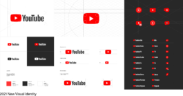
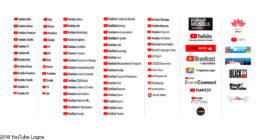
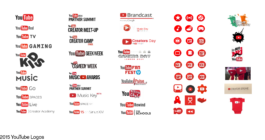
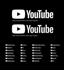
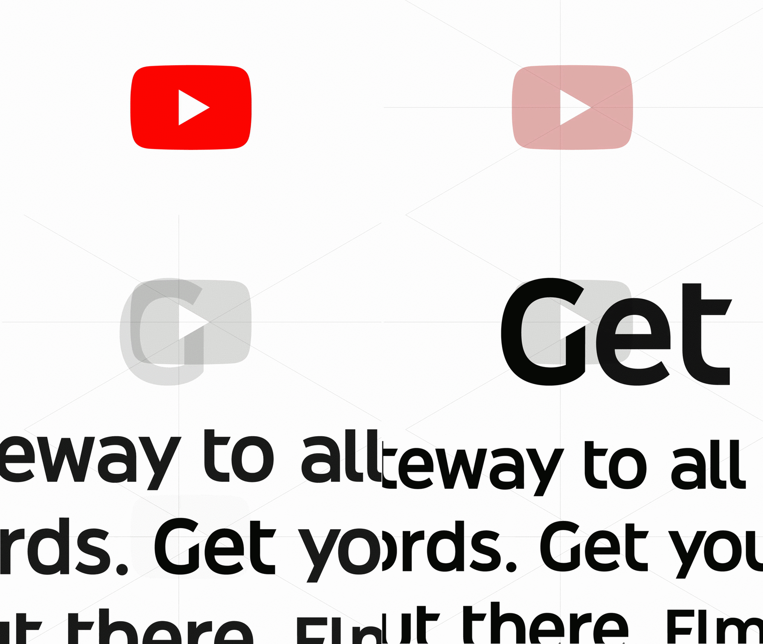
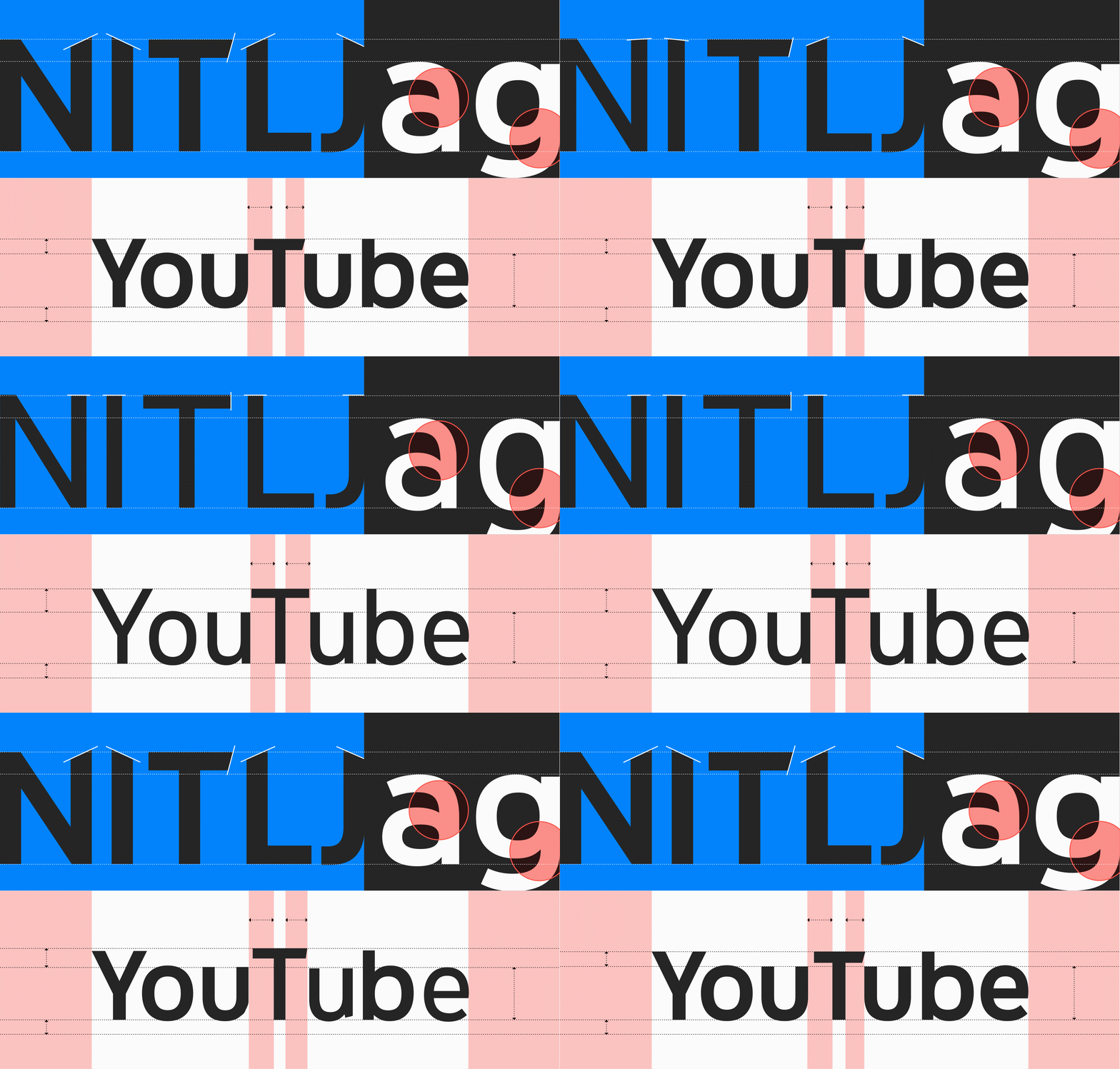
I played an integral role in evolving YouTube’s logo system, crafting a design that seamlessly adapts across a range of platforms—from mobile screens to large-scale billboards. Central to this effort was enhancing accessibility by introducing graded versions of the logo font to optimize contrast for both light and dark modes, ensuring clarity and readability.
We meticulously maintained consistency by developing assets tailored for various needs—pixel-perfect files for digital screens and scalable versions for high-resolution print applications. Emphasizing adaptability, I collaborated with a type designer, UX engineer, and marketing manager to ensure that every logo asset functioned flawlessly across all product interfaces and marketing channels. This collaborative approach ensured the YouTube logo remains a cohesive and iconic visual identity, regardless of format or context.

04 YouTube Sans
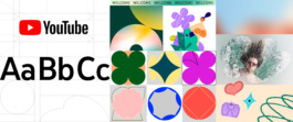
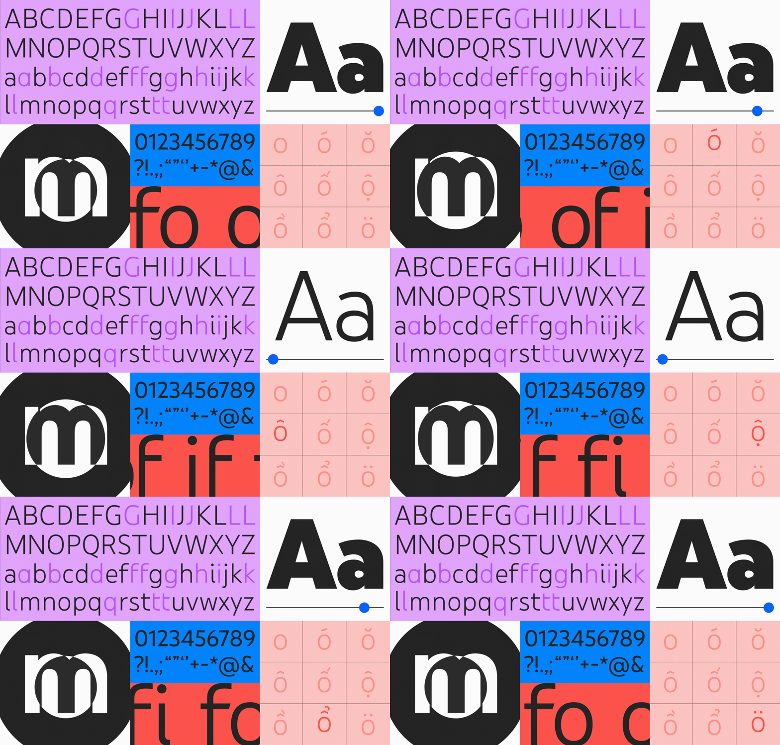
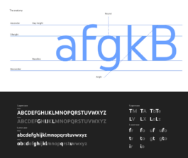
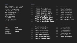
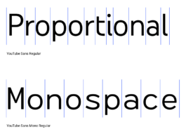
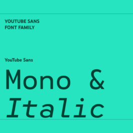
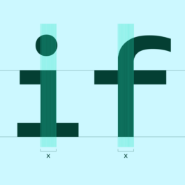
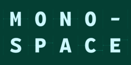
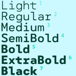
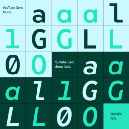
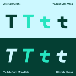
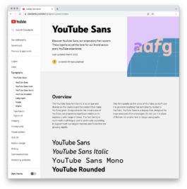
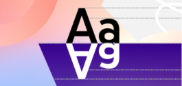
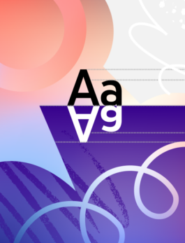
YouTube Sans is our proprietary typeface, a cornerstone of YouTube's brand identity. I contributed to its development, ensuring it reflects the diversity of the global YouTube community. This variable typeface includes alternate glyphs, stylistic sets, rounded, monospace, and italic versions, and built-in grades to enhance legibility across light and dark themes.
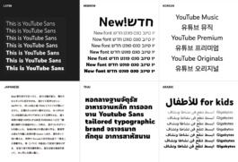
The font supports 219 Latin languages, 90 Cyrillic, 25 Arabic, and additional scripts, including Hebrew, Korean, Japanese, Thai, Tamil, and Devanagari. Contextual alternates dynamically adjust to surrounding characters, maintaining fluidity and balance across all text settings.
05 Patterns and Textures
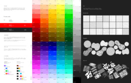
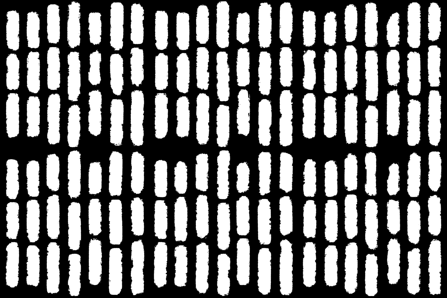
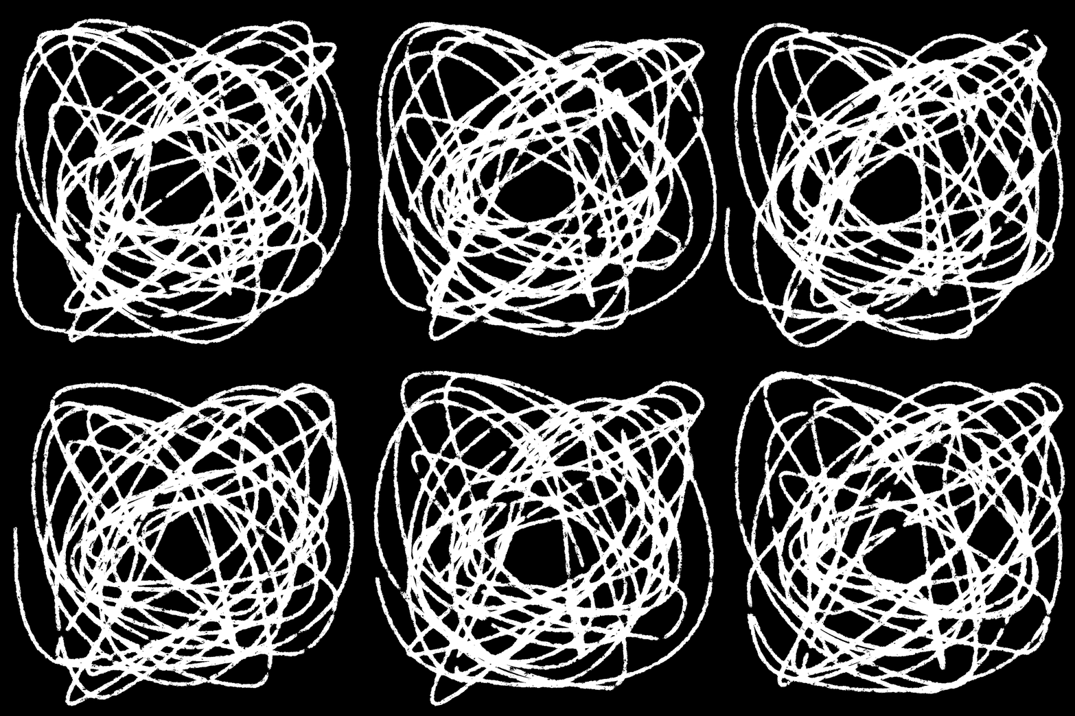
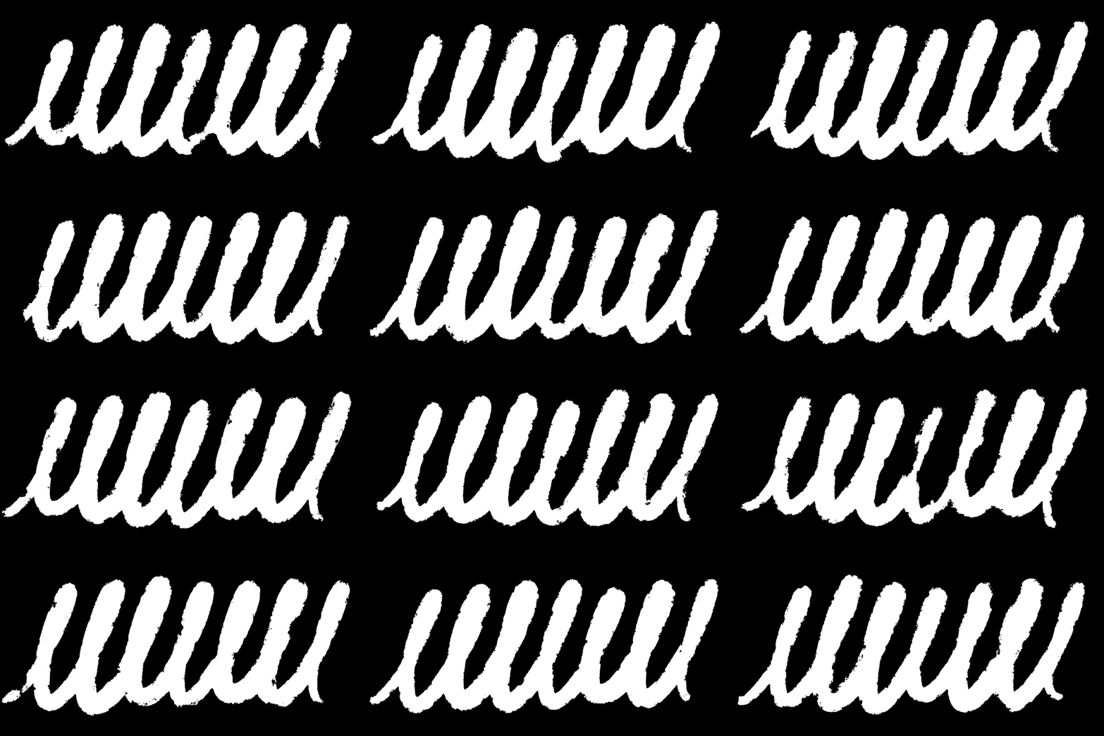
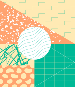
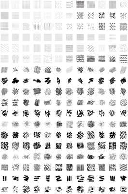
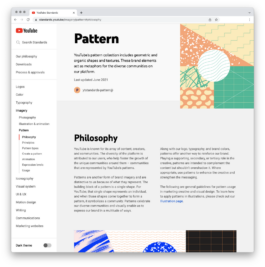
I led the creation of YouTube’s pattern system, developing a generative tool and library that symbolize the diversity of the user base. Inspired by the play button, I expanded the original isometric grid patterns into a flexible system with varied styles and non-repeating textures, adding a human touch and dynamic motion to designs. Collaborating with a UX engineer and several designers, we developed a proprietary tool that enables anyone to create unique, on-brand patterns within seconds, ensuring these modular assets adapt seamlessly across platforms.
06 Standards Website
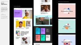
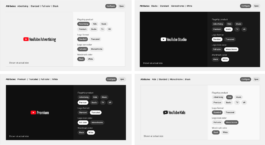
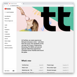
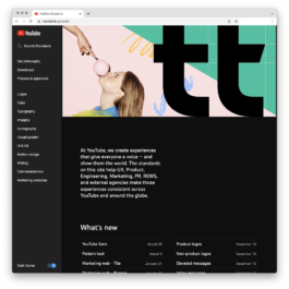
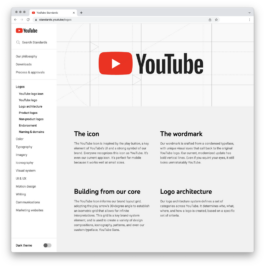
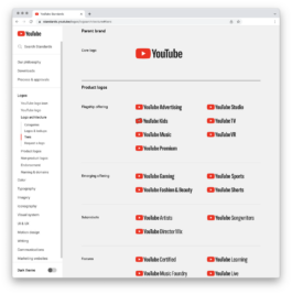
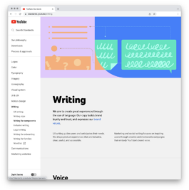
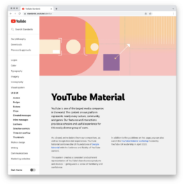
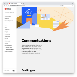
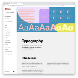
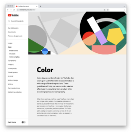
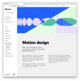
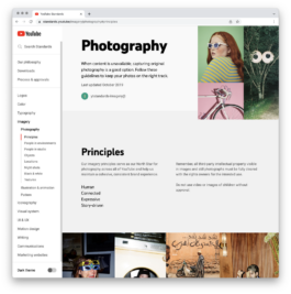
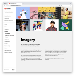
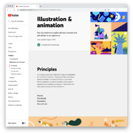
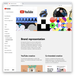
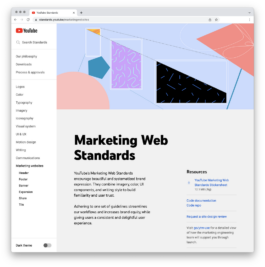
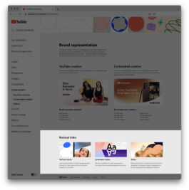
We developed a custom global brand standards website to ensure consistency across all platforms. This comprehensive tool includes design documentation, best practices, accessibility guidelines, internationalization support, and legal considerations. Available in light and dark modes, it aligns with YouTube’s product design and is a real-time resource for designers and partners worldwide.
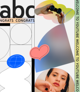
Header visual and thumbnail design ↓


Role Visual Development
Identity System Design
Since 2020, I’ve contributed to shaping YouTube’s identity system across products and marketing, collaborating with a multidisciplinary team of designers, animators, art directors, UX engineers, and project managers. Together, we operate as an internal creative agency, defining and evolving the brand. This includes YouTube logos, logo architecture, typography, iconography, color system, imagery, motion design, UI/UX, and generative AI.
01 Design in Action
Curated examples showcase how YouTube’s visual system delivers an immersive brand experience across diverse touchpoints. The design system ensures a cohesive and engaging user journey by seamlessly adapting product interfaces to global marketing campaigns.
Whether in digital, physical, or interactive spaces, the brand provides a unified experience that resonates with users. These examples showcase the system’s versatility, highlighting how YouTube’s identity scales effortlessly across platforms and integrates naturally into the brand experience.


Design Philosophy
Our first step was establishing a unified design philosophy connecting product and marketing teams while staying true to YouTube’s mission.
This foundation empowered us to expand YouTube’s visual identity across all platforms, focusing on consistency, clarity, and purpose.
Human
Diverse, Candid, Authentic
The vast majority of YouTube’s content is created by real people: non-professionals with cameras and ideas to share. Their little imperfections lend YouTube’s corpus a sense of humanity that very few other brands can own. Our design should never appear as if by magic. We should always let the viewer know that behind every expression is a real person.
Connected
Community, Belonging, Engaging
People come to YouTube to interact with and learn from other people. Everyday, more than a billion people from cultures around the globe meet and share their points of view. Our brand expressions celebrate these relationships, both philosophically and literally. They should never feel isolated or lonely.
We believe that everyone deserves to have a voice, and that the world is a better place when we listen, share, and build community through our stories.
Expressive
Vibrant, Imaginative, Intriguing
Whenever anyone posts a video to YouTube, they are expressing their point of view. Our design is never generic. It takes a bold stand, and is colorful, opinionated, and
reflective of the world. By communicating with an increasingly diverse range of specific voices, we expand our reach to new people all of the time.
Story-driven
Active, Perspective, Clear
Every video has a story to tell. Every upload adds another chapter to YouTube’s narrative. Our design feels like part of a greater story. We meet our characters in a singular moment. We can feel a sense of the plot and the action that has brought them to this point — and it’s clear that the action won’t stop when the moment is over.

02 Visual System
I was instrumental in creating YouTube’s dynamic visual system, driving the brand identity across product design and global brand operations. This system offers various visual expressions, delivering consistency while remaining adaptable.
Creating visual examples and supporting curated galleries, I demonstrate real-world applications, showcase best practices, and inspire designers. Developing the visual system ensures YouTube’s brand resonates consistently across user interfaces and global marketing campaigns.

Minimal

Medium

Maximum


03 Logo Creation
I played an integral role in evolving YouTube’s logo system, crafting a design that seamlessly adapts across a range of platforms—from mobile screens to large-scale billboards. Central to this effort was enhancing accessibility by introducing graded versions of the logo font to optimize contrast for both light and dark modes, ensuring clarity and readability.
We meticulously maintained consistency by developing assets tailored for various needs—pixel-perfect files for digital screens and scalable versions for high-resolution print applications. Emphasizing adaptability, I collaborated with a type designer, UX engineer, and marketing manager to ensure that every logo asset functioned flawlessly across all product interfaces and marketing channels. This collaborative approach ensured the YouTube logo remains a cohesive and iconic visual identity, regardless of format or context.


04 YouTube Sans
YouTube Sans is our proprietary typeface, a cornerstone of YouTube's brand identity. I contributed to its development, ensuring it reflects the diversity of the global YouTube community. This variable typeface includes alternate glyphs, stylistic sets, rounded, monospace, and italic versions, and built-in grades to enhance legibility across light and dark themes.
The font supports 219 Latin languages, 90 Cyrillic, 25 Arabic, and additional scripts, including Hebrew, Korean, Japanese, Thai, Tamil, and Devanagari. Contextual alternates dynamically adjust to surrounding characters, maintaining fluidity and balance across all text settings.


05 Patterns and Textures
I led the creation of YouTube’s pattern system, developing a generative tool and library that symbolize the diversity of the user base. Inspired by the play button, I expanded the original isometric grid patterns into a flexible system with varied styles and non-repeating textures, adding a human touch and dynamic motion to designs. Collaborating with a UX engineer and several designers, we developed a proprietary tool that enables anyone to create unique, on-brand patterns within seconds, ensuring these modular assets adapt seamlessly across platforms.


06 Standards Website
We developed a custom global brand standards website to ensure consistency across all platforms. This comprehensive tool includes design documentation, best practices, accessibility guidelines, internationalization support, and legal considerations. Available in light and dark modes, it aligns with YouTube’s product design and is a real-time resource for designers and partners worldwide.


Header visual and thumbnail design ↓


Copyright©2019-2025 ChingFa Lung - All Rights Reserved
Copyright©2019-2025 ChingFa Lung - All Rights Reserved
